How to make a scientific conference poster
Our top tips to make an impactful poster at your next conference
Introduction:
A poster at a scientific conference is not only a communication tool for your research but also a networking tool. Conferences attract fellow researchers, including leaders in their field, and biotech industry sponsors. They will be scanning posters, so make sure that yours is eye-catching to attract viewers and spark some interesting conversations. Poster presentations are a great opportunity to get feedback on your work from people outside your research group and to help guide future experiments or anticipate comments from future reviews when trying to publish.
Designing your poster:
A poster is a graphical representation of your abstract and should include the same sections. The main tip for a poster is to include just enough information for someone to read it without you there and understand what, why, and how you performed your experiments. Finer details can be given in person when presenting your poster.
- Introduction/Background: This can be a large diagram or graphic to reduce the amount of text and stand out. If you do use text, avoid long sentences with excessive jargon and define any key terms that will be used later.
- Aims: Use concise bullet points. Focus on the aims from the data on the poster, not your whole project.
- Methods: Keep these short and avoid the fine details unless they are a key factor in the research (for example, research optimizing a new technique).
- Results: We recommend a maximum of 2-4 results headings, with a short, clear title for each result.
- Conclusion and future impact: Use well-defined, concise bullet points and relate them to the broader research context.
- References and acknowledgments: A few key references are enough for a poster; you don’t want to use much of your precious poster space on this.
- Summary/Take-home message header: These are an effective way to tell your audience in 2-3 sentences about your research and whether they should interact with your poster.
- Contact details: Don’t forget to include how someone can contact you later. Include an email address and perhaps your social media handles. QR codes can be excellent tools.
- Sponsors: Always mention your sponsors whether they are at your university, a government funding body, or perhaps a company like Proteintech that awarded you a travel grant.
You don’t need advanced software to design your poster, you can do it in PowerPoint.
Set the size and orientation according to the conference guidelines:
Design →Slide Size → Custom Slide Size → Set width and height (A0:841x1189mm, A1: 594x841mm).
Make a draft of the story of your poster before adding the content. Be selective with the data and information you include to captivate your audience; avoid overly long figure legends or text boxes. Try outlining different sections with a box and organize these logically to help the audience follow the content on the poster (we tend to read from top left to bottom right).
A color scheme is an effective way to increase the impact of your poster (check with your university or funders if there is an expected color scheme you need to follow). You can also use this to add bright colors where you want to draw special attention. Just be careful not to overdo it as an excessively decorated poster can detract from its content.

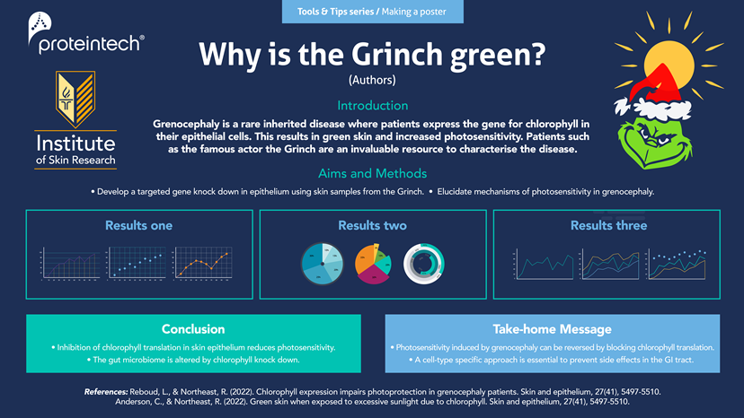
Figure 1: Example of a poster for a scientific conference (N.B. the content on the poster has been imagined and is not based on actual scientific research)
Top tips to make an impactful poster:
- Spend time making it: A good poster will require thought and planning. Give yourself plenty of time to map out which narrowed-down part of your research you will present and the figures you want to include.
- Use a BIG catchy title: Use a large enough font and keep your title short, simple, and to the point (not the title of your thesis or paper). This will help the audience to establish whether your poster is of interest to them. Avoid jargon or less well-known acronyms for the title.
- Use large visuals: No one will be drawn to a poster filled with small text and few images. A large visual, whether it’s a summary diagram or a graphic related to the research, will make your poster stand out. This draws people closer and encourages them to read the text where they can then learn about the details of your work.
- Consider your audience: Adapt the content depending on whether it’s a large congress on a very broad research area (e.g., neuroscience, cardiovascular, cancer) or a smaller, niche conference (e.g., breast cancer metastasis). This will inform you on how specific to make the poster.
- Practice the poster presentation: Once your poster has hooked someone’s attention, you now have the chance to complement it with your presentation. Prepare and practice this; consider having some handheld notes with bullet points ready to ensure you get your research across. Be prepared to answer questions and expand further on the data included in the poster. Present the research in a story format to keep your audience engaged.
- Follow the conference poster format: You don’t want to stand out because your poster is the only landscape one in a sea of portrait posters. The conference will certainly have provided guidelines on the size and orientation, so be sure to read them!
- Use a QR code to link to your paper or LinkedIn/Twitter profile: This is increasingly popular at conferences and an opportunity to prolong the impact of your poster and your networking efforts! People in industry are very keen on LinkedIn, while academics tend to be more on the Twitter train. Make sure your LinkedIn profile is up-to-date if you are doing this.
|
TIP: If you’re attending a virtual conference, reduce the amount of text even further and maximize the digital format by including hyperlinks, demos, animations, or short videos. |
Do’s and Don’ts of Scientific Conference Posters
Do |
Don't |
|
Use simple, direct sentences |
Use excessive jargon or abbreviations |
|
Include bullet points |
Include small text |
|
Be by your poster at the advertised times |
Display too much data |
|
Practice your presentation |
Overcrowd the poster with images |
|
Make your poster a story |
Use too many colors |
|
Have a summary/Take-home message box |
|
|
Proofread the content |
|
|
Be welcoming and enthusiastic |
|
|
Follow up with those you met at the conference via email or LinkedIn |
Blog written by Lucie Reboud, Intern at Proteintech, PhD student in cancer research at the University of Manchester.
Related Content
How to succeed in an interview - Academia vs Industry
Example PhD interview questions and answers
CV writing for academia and industry
How fellowships can advance your scientific career
Transitioning from Academia to Industry
Support
Newsletter Signup
Stay up-to-date with our latest news and events. New to Proteintech? Get 10% off your first order when you sign up.
